Prologue / Prolog – Burcu Gökçek
10 Ekim 2023
Merve Boyabatlı
“Prologue” is the title of this solo exhibition created by Burcu Gökçek and is now open to visitors at Ferda Art Platform. The artist’s works in this exhibition depict the 2020-2023 pandemic period. The exhibition consists of two parts.
In the first and main part, we see acrylic works made on rectangular panels and it draws attention that these works consist of different rooms, stairs and corridors of a house. While interpreting these works in general, the artist describes the dreams that people had during the pandemic. She explains that people were confined to their homes during those periods and that they revived their dreams sometimes with music and sometimes by following a light. Especially when I read the expression “following a light”, as she mentioned, the light beams she included in her works attracted my attention. The room was illuminated by lights that seemed to come from nowhere, while in her other works there seemed to be a desire to follow the light coming from behind the doors. I think another point that the artist wanted to emphasize was the discovery of an inner world as people stayed at home during the pandemic. While I thought that people discovered their own loneliness and their own world during the process of staying at home, looking at these works seemed more sincere to me.
Moreover, the home decor that the artist used in her works may be familiar to many viewers. As one of my first impressions, I realized that the decor used in the house, the design of the rooms and especially the use of warm colors evoke this feeling. Another reason why this decor and design of the houses in the works of the artist seem so warm may be the intensity of the details used by the artist. The intensity of these details provides the viewer with the freedom to explore their own world. It is possible for the viewers to extract points from each detail that they can interpret differently according to their own inner world.
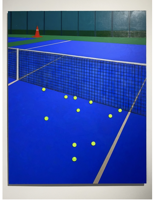
The last two works from the main part of this exhibition are from the outside. For example, the artist chose a tennis court as an outdoor space. In one of these tennis court paintings, we see that many tennis balls were unable to pass to the opposite side of the net. It was very difficult to interpret this work when I first saw it. Then I saw that the title of the work was “Closed”, and this involuntarily gave me a feeling of negativity and hopelessness. When I thought about the title of the work and the balls that could not pass to the opposite side of the net, I interpreted that it could indeed be a representation of despair. The reason for this despair may perhaps be due to the pandemic period and the artist may have established the connection between the interior and the exterior in this way.
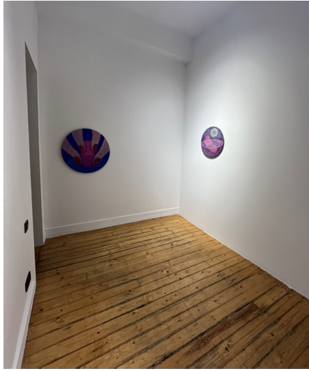
The second part of the exhibition welcomes the audience with acrylic paintings on four round panels. This part feels more positive than the first part. I am not saying that the first part is completely negative. However, I understood better that the exhibition was about the pandemic period in the first part of it. This part makes me feel more peace and hope. I think these four works are connected to each other and their themes complement each other. The colors used are on the blue, pink and purple scale, which also evoked positive feelings. What I understand in the second part of the exhibition is that life after the pandemic is seen as a second beginning and the artist sees people’s emotions and feelings after the pandemic as something newborn. She interprets the reunion of people with their old lives as a new feeling they have just experienced and displays it to the audience in this way.
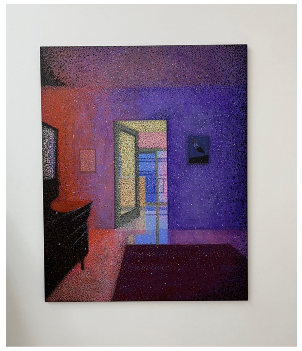
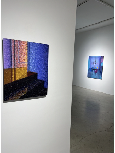
After an overview of the exhibition, there is one work I want to focus on and write about: Waking Up, 2022. As you can see on the side, this painting is from the first part of the exhibition. This painting was made in acrylic on a rectangular panel measuring 125×100 cm. The colors in this painting flow fluidly from orange and pink to purple. Since the painting depicts a room of the house with warm colors, I think it is aesthetically pleasing to me. The contrast between orange and purple creates a visually pleasing image. I was also interested in the punctuation technique the artist used in the painting. I think there is a state of movement in the painting as a consequence of this punctuation technique. The density of the dots, their different sizes and colors are the elements that sustain this movement. This sense of mobility reminded me of the interpretations of the works of Mark Rothko, one of the leading artists of the formalism art movement. When I was researching Mark Rothko, I came across that most of his works had an interpretation of vibration felt by his viewers. Rothko, who achieved this through the use of shapes and colors in his works, evoked a relaxing feeling in his viewers. Burcu Gökçek’s use of punctuation in this piece, compared to the others, evoked meditative feelings in me. Even though it is a painting that does not fit the rough definition of formalism, this was the first association I had. Later, when I thought about the work in more detail, the pandemic period in which the work was made and the fact that it can directly convey this to its audience made me think that it could also be related to expressionism. What is essential in expressionism is that the emotions of the artist and the viewer meet on common ground (Sheppard, 1987). Considering all these, I can interpret this work as closer to expressionism. Apart from belonging to an art movement, this work feels warm and familiar to me. Seeing another part of the house (I think it is a corridor or a hallway) through a room in the work also arouses curiosity.
Finally, what draws my attention is the presence of different works on two separate walls that I see as a painting within a painting. While the one on the left is simpler and contains the artist’s punctuation technique, the one on the right strikes me as a more realistic painting. In general, I found Burcu Gökçek’s “Prologue” exhibition aesthetically pleasant. When I looked at the details of the works and when I examined the catalog while visiting the exhibition, I understood much better what the exhibition wanted to say and that it served common language and feelings.
References:
- “Formalism” Sheppard, Anne. Aesthetics: An Introduction to the philosophy of art. pp. 38-56.
- Expressionism”: Sheppard, Anne. Aesthetics: An Introduction to the philosophy of art. pp. 18-39.
- Burcu Gökçek’s Exhibition Catalogue https://www.ferdaartplatform.com/_files/ugd/a366c5_a0755ecb0c0749c98e21859717 d38249.pdf